WEEK 15
High Fidelity Prototype 1 progress
15.1 Continue on high fidelity prototype 1 User Interface design progress
This week, I continue on the high fidelity prototype 1 user interface design. During the process I have lots of trials and error to experiment with all the layouts, button and more.
Here are some of the continuous progress of the high fidelity prototype 1 user interface design :


15.2 Linking high fidelity prototype 1 User Interface
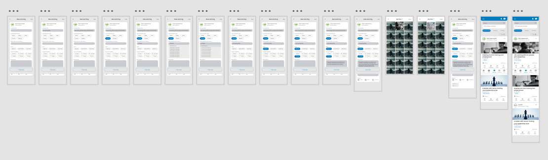
After done with the user interface design for the high fidelity prototype 1, I started to link all the frames together. This process is indeed challenging which it has so much of buttons and links. Meanwhile, some part requires some animations which I've never experience before. Therefore, I spend some time to research on how to do those transitions and animation. During the process, I also add on some frames to make sure have a better user experience. However, it is a quite fun process where I realised there are so much possibilities to do with Adobe XD. In the past, I'm keep wondering on how the people present a non-real product for idea pitching in TV shows. Now, I finally understands it. I learned quite a lot in this project, so I hope in the next semester, I can make it more advanced as now I have limited time so there won't be plenty of time to add on more functions.
Below are some of the linking progress of the high fidelity prototype 1 ("bluebee') :


Prototype 2 progress
15.3 Plan on high fidelity prototype 2 name & write down a clearer positioning
After done with the high fidelity prototype 1, it is time to start with the 2nd prototype. I decided to think a new branding name for the 2nd high fidelity prototype because I want 2 prototypes to give different feeling and mood so I can see which one is user's more prefered. Thus I did some brainstorming using a mindmap to give myself some ideas on the name of the 2nd high fidelity prototype branding. I have a rough idea on using plants like cactus as the symbolic of 2nd prototype branding, thus I research some of the cactus name.
Below are the mindmap that I did for brainstorming name ideas :

There are a few ideas of the name, but I've chosen "Cacti" as the final brand name. It is because it represents the people with disabilities are strong. They survive in harsh conditions just like the cacti. Besides, they will have interesting blooms if they are willing to learn as well as showing their talent. They are just same as everyone, who have talents. Moreover, it also suits the identity that we care about them, with unconditional love and care. Hence, the name "Cacti" came out.
15.4 Brand identity planning
After confirm with the name ideas, I started to think of the brand identity for the 2nd prototype. In order to have a rough idea on the identity, I also did a mindmap to help me out during this process. For this 2nd prototype, I decided to make something more fun instead of a corporate feel. It is because illustrations, fun image will attract and more comfortable for the users with disabilities. They can get the message more directly and rapidly. Hence, I decided to have a symbolic character for this 2nd prototype branding and also some interesting illustrations to beautify and to complete the whole branding of this 2nd prototype. Other than that, I wanted to do an IOS system app, so the keyboard are basically follow IOS system and this time, the type font I chose to use San Fracisco Pro Text. Actually it is written in the Apple website that, we are not necessary to use their system typefont to do an app even we are doing IOS system app. However, due to the 1st high fidelity prototype using other fonts, this 2nd prototype I want to try their system font.
Below are the midnmap of the brand identity planning.

After having an idea of the whole brand identity for the 2nd prototype, I have made decision on the colours that is going to be used, which is green. I chose green as the brand colour is because it suits the cacti identity, yet it is also a friendly colour to the disabled users. Thus, by creating more fun design elements, I decide to use stroke and more colours in the illustration.
15.5 Logo design progress
I started to work on the logo for this 2nd prototype. Before getting started, I did some research for the references of the logo. I'm looking forward to more cute and fun design.
Here is the logo design references that I found :
[R&D] w15 - Logo Refere... by CHAO CI XIN
I started to work on the logo by sketching some of the ideas in mind first. It is to help me have an idea on how would the logo looks like and if it is suitable for the branding. Here is a rough sketches of the logo ideas.

After having a rough idea on the logo look and feel, I started to bring the logo on digital and experiment on it. The aim is to create a logo with some hints and symbolic icon on logo but then when comes to the app it has the illustration expand from the logo. Therefore, I've tried few logo and have trials and error on creating the logo until the end results.
Here is the logo design progress for the prototype 2 :
[R&D] w15 - High Fideli... by CHAO CI XIN
15.6 Character & illustration design progress
After done with the logo design and have a decision on which logo to be used, I started working on the character design as well as the illustrations part. Before getting started with the character design, I did some research on the references of character design. It is to stimulate me to came out with a cute character design. Well, it is indeed a fun project where I could experiment different types of stuff.
Here is the references research on the character design for prototype 2 :
[R&D] w15 - Character &... by CHAO CI XIN
I have a few ideas came out on my mind for the character design. Thus, I immediately start to experiment with it, and create the character for this 2nd prototype brand. Basically, it is a cute cactus with different friends or types. It symbolised it have many different friends too, and they connect with each other. Some of them are disabled, some of them are employers and many more. Each with different expression on their face and movements. Meanwhile, when creating on the character, I also did illustrations to apply on the prototype.
Here is the character design and illustrations progress :
[R&D] w15 - High Fideil... by CHAO CI XIN
So far I'm satisfied with the 2nd prototype more because it has more fun identity. Meanwhile, when I ask opinions and comments from my friends which is disabled. They also like the cacti character very much. The comments make me have more motivation to continue the project! Hence, I continue to the next phase of the project, which I need to work on the user interface of the 2nd prototype.
15.7 High fidelity prototype 2 User Interface design progress
Before get started with the 2nd prototype user interface design, I did some references research to see whether there are possibilities to have a fun layout. Moreover, I also changed some of the user interface layout design due to the feedback from the previous usability test. I want to try different layout as well as buttons or others to see which are the user's more preferable. Hence, when working on the 2nd prototype, I spend a lot of time experimenting with the layout, buttons, animations frames, easier and more friendly design for the users with disabilities. It is indeed a fun process where I actually get to know more and understand more about the people with disabilities. Such as the "learning" details frame & the "job" details frame, I separate it into a few category is because it will be easier to look instead of one whole long page with words.
Below are some of the references of user interface design :
[R&D] w15 - High Fideli... by CHAO CI XIN
As for the progress of the user interface design, below attached with some of the user interface design :


Comments
Post a Comment