WEEK 16
High Fidelity Prototype 2 progress
16.1 Continue on high fidelity prototype 2 User Interface design progress
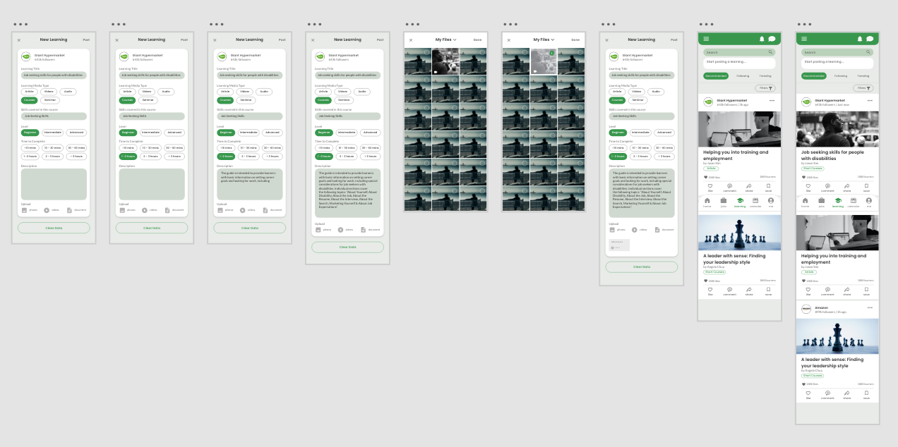
I continue on the high fidelity prototype 2 user interface design. During the process I have lots of trials and error to experiment with all the layouts, button and more.
Here are some of the continuous progress of the high fidelity prototype 1 user interface design :


16.2 Link the high fidelity prototype 2 User Interface
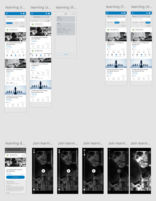
After done with the user interface design for the 2nd high fidelity prototype, I started to link all the frames together. This process is indeed challenging which it has so much of buttons and links. Meanwhile, some part requires some animations which I've never experience before. Therefore, I spend some time to research on how to do those transitions and animation. During the process, I also add on some frames to make sure have a better user experience. However, it is a quite fun process where I realised there are so much possibilities to do with Adobe XD. In the next semester, I hope I can make it more advanced as now I have limited time so there won't be plenty of time to add on more functions.
Below are some of the linking progress of the high fidelity prototype 2 ("Cacti") :


16.3 Usability Test 2
After done with both high fidelity prototype, I decided to do one more round of the usability test to see which prototype they more prefer and also the functionality, user experience based on their needs and expectations. During the process, I give the target user a specific task to achieve when conducting the usability test on both high fidelity prototype. I have recorded down the results and give them to fill up the User Acceptance Form so I could understand which part of my prototype need to be improved.
In this usability test, it is aimed to make sure the user experience and user interface are in accordance with user's expectations, preferences, desires and actions. It helps me to know what is the issue faced by the users while completing the task given to them so I could improve the user experience. Meanwhile it would help me to identify which kind of designs they will more prefer, the more corporate ones or the more fun ones.
Link to usability test result of high fidelity prototype 1 : click here
Link to usability test result of high fidelity prototype 2 : click here
Result screen recording of usability test (high fidelity prototype 1 "BlueBee") :
a) User 1 // Job seeker who is partially blind // Turn on "Easy Mode" feature
b) User 2 // Job seeker with hearing disability // Turn on "Sign language" feature & join learning
c) User 3 // Job seeker with physical disabilities // Apply a job
d) User 4 // People with physical disabilities // Join a learning
f) User 6 // Owner of a company // Post a job listing
g) User 7 // HR worker // Post a new learnings
h) User 8 // HR manager // Schedule a new event
Result screen recording of usability test (high fidelity prototype 2 "Cacti") :
a) User 1 // Job seeker who is partially blind // Turn on "Easy Mode" feature
d) User 4 // People with physical disabilities // Join a learning
h) User 8 // HR manager // Schedule a new event
16.4 User Acceptance form (2nd time)
This time, the user acceptance form have a little bit different, which I have added on 2 more questions to help me identify which prototype they are more preferred and also which designs will more friendly to them. Beside, it is also to test if there are other issue faced or missing frames that need to be added on.
User Acceptance Form link : https://forms.gle/3zXHuPUiaL4eh6T8A
Below are the questions that have a little bit different from the 1st one:


16.5 User Acceptance form Result & Analyse (2nd time)
After done with the usability test, I give them to fill up the User Acceptance Form so I could understand which part of my prototype need to be improved. Most of them are okay with the naturalness and the icon sizes as well as the features or functions. Just one minor comments is some frames are missing. Another comment is that, users hope to have "categories of jobs" in the "jobs recommended" interface. It is because this can help the users that not sure want to start finding what. In which users can be lead by the categories of jobs to start finding jobs. Yet, at the "learning" interface, users hope to have "topics category column" to lead them easier to have idea on what "learning" they wanted to browse through.
Below are the results from the 2nd User Acceptance Form :


16.6 Conclusion of usability test 2
From the result get from the usability test and the user acceptance form, most of the users are more preferred to the 2nd high fidelity prototype, which is the "Cacti". It is because the user interface design is more fun when browsing through and will not feel boring. It could attract them it grab their attention more too as it is easier to understand with illustrations too. However there are some parts still need improvements for a better user experience. Thus, I list it down as a summary of things need to be improved.
Things need to be improved/make amendments (for further development):
- on the "job recommended" interface, it could be great if added "categories of jobs" thumbnails to lead the users on searching jobs
- on the "learnings recommended" interface, it is more functional if added "topics categories" thumbnails
- it could be great if there are a place where they can see their applied jobs
- it could be great if users can download the learnings
- it could be great if users can switch account because some of the users with disabilties also is an employer/ recruiter which owns a company. They wish to hire people too where they hard to find platform helped them out.


Comments
Post a Comment