WEEK 13
13.1 Usability Test (1st round)
After done the User Acceptance Form, I started to carry out usability test this week. At first, it was a really challenging task for me to find people with disabilities to participate in this test. However, after trials and error and the help of one of my friend (who also a person with disabilities), I finally found few more participants with disabilities to participate in the usability test. During the process, I give the target user a specific task to achieve when conducting the usability test on the low fidelity prototype. I have recorded down the results and give them to fill up the User Acceptance Form so I could understand which part of my prototype need to be improved.
In this usability test, it is aimed to make sure the app function, features and flow are in line with user's expectations and needs. It helps me to know what is the issue faced by the users while completing the task given to them so I could improve the user experience.
User Acceptance Form link : https://forms.gle/JyYq8hwxQ2xU9x8b7
Result screen recording of usability test :
a) User 1 // Job seeker who is partially blind // Turn on "Easy Mode" feature
b) User 2 // Job seeker with hearing disability // Turn on "Sign Language" feature & join learning
c) User 3 // Job seeker with physical disability // Apply job
d) User 4 // People with physical disability // Join a learning
13.2 User Acceptance Form Result collection
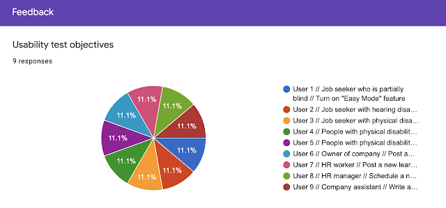
After done with the usability test, I give them to fill up the User Acceptance Form so I could understand which part of my prototype need to be improved. Most of them are okay with the naturalness and the icon sizes as well as the features or functions. Just some of the parts need to be improved like the "Clear data call-to-action" button is too obvious which could trigger users to press it. Next, is some of the bug were shown in the prototype. There are also some parts where the scrolling screen were cut off half which users commented it is quite weird and don't understand thee intention to design like that. Other than that one of the user also verbally commented that the layout of some screens are confusing, such as the menu page. There are also some missing frames which need to be added on.
Below are the results and comments of from the User Acceptance Form:
13.3 Analysing, sum up problem to fix
After getting the feedbacks from the users, I realised there are a few parts I need to make changes on the prototype to have a better user experience. Hence, I analyse the results and do a sum up list of parts I need to improve and make ammendments.
Parts need to be improved and make changes
a) "Clear data" call-to-action button button too obvious
b) Recheck all linking part
c) Recheck all layers' sequence
d) "Hamburger menu" need to change layout
e) "me" page need to make it more easier to see or fill up, instead of all words only
f) Recheck all missing frames & add on the frames + animation frames
g) The name of the project "Ticket to be seen" is too long & hard to remember, it is better to come up with a better name to recognise it easier & more attractive
13.4 Iteration design
After collecting feedback from the users, I analyse the comments and made a conclusion on the parts I need to do some amendments. Then, I started to make amendments on my low fidelity prototype in order to provide a better user experience for the users. Below are some of the iteration design did after analysing the results. Some of it has changed on the layout, some of it is the design of the buttons, some of it is the bugs on the prototype. Other than that, there are some missing frames that didn't appear in the prototype which cause some confusion to the users. Thus, I decided to add on some of the frames too to make the prototype even better.
13.5 Prototype Documentation
After complete the usability test and get feedbacks from the users using user acceptance form. I have done iteration design based on the comments given. It is indeed an interesting process where we usually would not see the mistakes when we faced a project for too long, therefore aspects from different users are very helpful to me to make improvements. Thus after done with the iteration design, I document my prototype down and below is the prototype documentation.
[R&D] w13 - Prototype D... by CHAO CI XIN


Comments
Post a Comment