WEEK 14
14.1 More further research
Before getting started with high fidelity prototype 1, I decided to do more research on the user interface design for disabled people as well as for people without disabilities. Also, I did some research on the tips and guidelines on the colours friendly for the users with disabilities, tips on creating a better user interface, tips on creating user interface for people with disabilities and many more. It is to help me have a better understanding on the user interface design while start working on the high fidelity prototype. After having some research, I realised there are so much details we need to pay attention on while designing user interface of an prototype especially for users with disabilities. Hence, during the research, I also did some brainstorming on what colours are suitable for the branding which meanwhile disabled friendly to the people with vision impairements.
Below are some of the research done before getting started with high fidelity prototype 1:
[R&D] w14 - Further Research on Interface Design by CHAO CI XIN on Scribd
Prototype 1 progress
14.2 Replan project/product name & write down a clearer positioning
At first, my product name was "Ticket to be seen", meaning to give a chance to be seen. However, this name not so suitable for branding, yet when I ask for opinions and comments from the users, they also give feedback that it is too long for the name and harder to remember or recognise. Therefore, before getting started with my 1st high fidelity prototype, I decided to rearrange all the positioning and also the branding name because although it is an app prototype but branding still plays an important role in apps. Thus I did some brainstorming using mindmap to give myself some ideas on the name of the 1st high fidelity prototype branding.


There are a few ideas, but at last I've chosen "bluebee" as the app name. It is because blue is a colour that accessible to the people with disabilities. In which some of the people who have vision impairment will feel more comfortable and can be seen the colour using blue colour. On the other side, I'm using bee is because it is somehow links to the "people with disabilities" , where they hardworking, perservance, fruitfulness and more. I wish to create an identity of this app to encourage the people use the platform to learn anything they want there and to find jobs without worries, as well as to social with each other to create a positive community. Hence, the name of "bluebee" came out.
After confirmed with the brand name of first high fidelity prototype, I decided to do some research and brainstorming on the whole identity system of the brand. Hence I did a mindmap to help me in my brainstorming idea session.

After having a few rounds of brainstorming with myself, I decided to make this 1st high fidelity prototype with a more corporate feeling, in which the mood and feel will be more serious. As for the illustration, I will apply a little bit but not too much. It is because I would like to compare 2 prototypes which 1 one of is more serious and another is more fun looking.
After having an overall idea of the 1st high fidelity brand, I started to create logo for the 1st high fidelity prototype. However, before I put it on digital, I decided to have some research on the logo reference and also do some sketches first so I could have a rough idea on the logo which is better to execute.
Below is the logo references :
[R&D] w14 - Prototype 1... by CHAO CI XIN
Below is the sketches of logo design :

After having a rough idea on the logo, I started to go it digital. During the process, I have also make decision on the blue colour code. This colour has been verified by the "Web Content Accessibility Guidelines (WCAG) 2.0", which means this colour is disabled friendly to users with visual impairments.
Below is the logo progress :


After few rounds trial and error which I didn't showed it on here, I have finalised the logo look. It met my expectation where initially I wanted it to be more corporate feel, so I've chosen this colour. Thus, the logo design also will be more simple but have it's own icon too which it can much more easier to recognise or remember. I converted and twerk the "e" word to become a bee icon, in which this shape will appear in the character design too, so it is part of a linking.
From the bee icon I did previously, I decided to create a few character and illustrations to put in my 1st high fidelity as part of the designs. Although the 1st high fidelity prototype is more to corporate feel, but I wish to put a little bit of identity elements inside to feel more interesting yet maintaining the corporate mood and feel. Thus, before getting started with the character design and illustrations, I did some research on the character design.
Here is some of the reference of the character design :
[R&D] w14 - 1st High fi... by CHAO CI XIN
After having some research on the character design, I started to work on the character design and illustrations. It is expanded from the bee icon in the logo, yet the illustration style is using stroke and simple colours combination. There are a few illustrations were also created during the progress including the bee is exploring something, the scene that it's happy, curious, finding job and many more.
Here is the character design progress of the 1st high fidelity prototype :
[R&D] w14 - 1st high fi... by CHAO CI XIN
14.6 Prototype 1 User Interface design progress
After done with the logo, branding and illustration design, I started to work on the user interface of the 1st high fidelity prototype. It is indeed a big workload as it requires many frames to do an animation move. Other than that, there are much more other wireframes need to be added for a better user experience. As this is the first time I experience with creating a working high fidelity prototype, there are some parts which I have no idea how to do. Therefore, I search for Youtube tutorial too to learn on these animations, transitions, as well as how to fully utilise the adobe XD to create my high fidelity prototype.
While working on the prototype, I also fill up with real contents in order to showcase the prototype in more real feeling. I also followed the design principle which the icons, text, buttons requires a sizes. During the process, there are so much trials and errors in working on the user interface because some of the layout I feel need to make changes to have a better user experience. Yet, there are also many small details to take care of during the design. Thus, I think it is totally a new experience to me which helped me to learn a lot during this semester. I managed to explore new skills and deeper research in this project. Like some of the transition, I have no idea how to use it or fully utilised it, therefore I did more research on how to use these functions in adobe XD. These steps are actually helping me to gain more experience and knowledge. Thus, I'd started to gain interested in UI UX field.
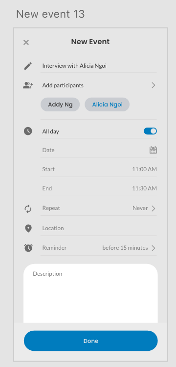
Here are some parts of the 1st high fidelity prototype progress :


Comments
Post a Comment